ux/ui concept, mobile application
the met mobile
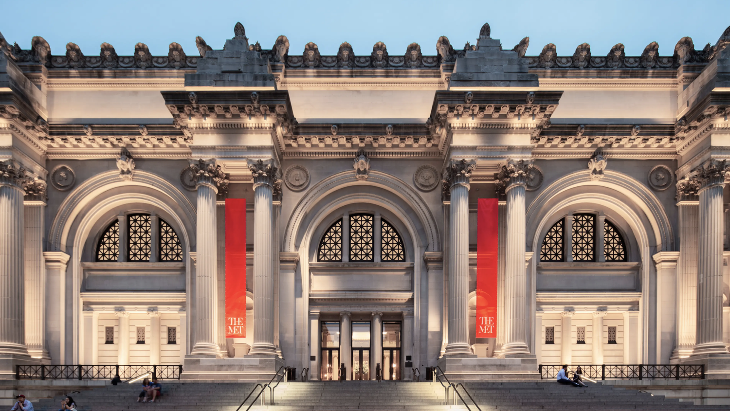
the met has no official companion app for in-museum visitors. i designed one, a concept exploring how the metropolitan museum of art could turn a gallery visit into something more immersive, guided, and accessible.
the opportunity
walking through the met is overwhelming in the best way. but there's no digital layer to help visitors navigate, learn, or go deeper. this concept bridges that gap.
the user
i designed for everyone: younger visitors who want a richer digital experience, and older visitors who prefer structured, audio-led guidance through the galleries. accessibility was non-negotiable from the start.
process
i started with research into how people actually move through museums, then built personas based on real visitor behaviours, and mapped the journey through sketches and storyboards before touching figma. from there i moved from lo-fi wireframes through to a fully interactive hi-fi prototype in figma and adobe xd.
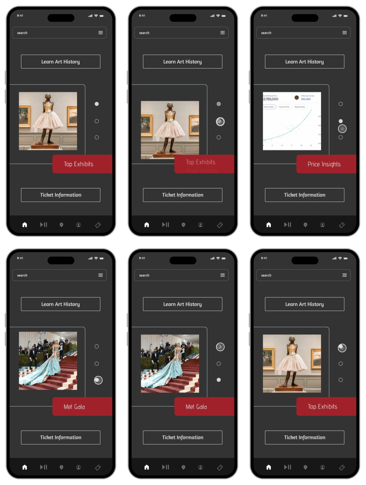
the app centres on three things: audio-guided tours tied to specific galleries, digital exhibit content accessible in-gallery, and a met gala archive for the culturally curious. everything was built to ada and wcag standards.
result
a fully interactive prototype showing what an accessible, multigenerational museum app could look like. figma files available on request.
the prototype
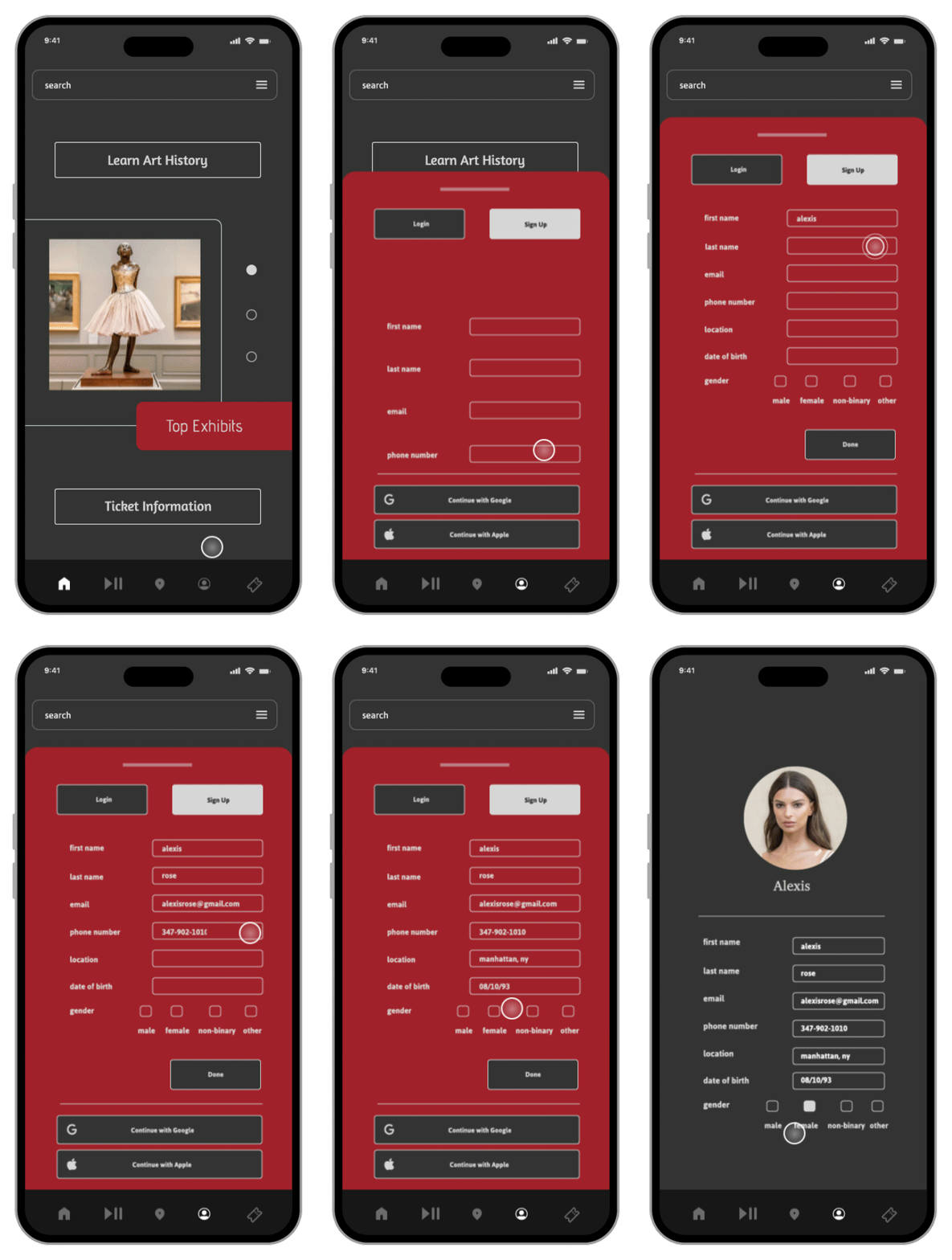
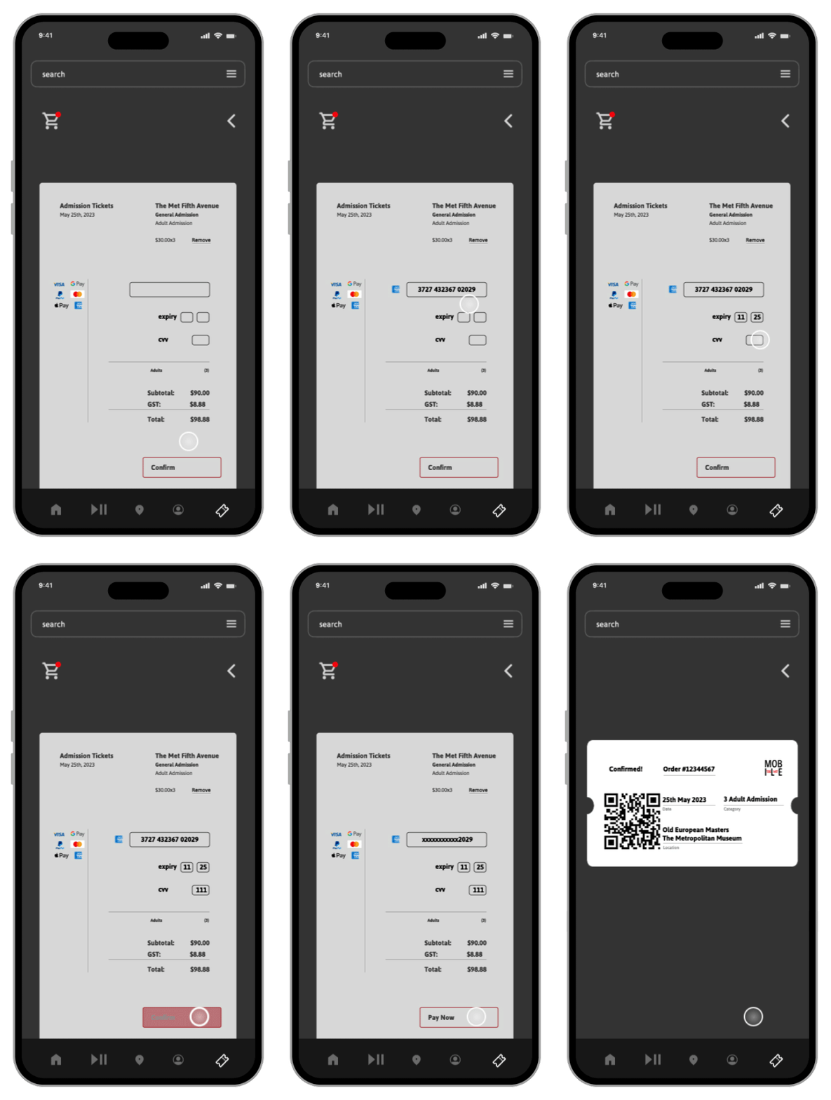
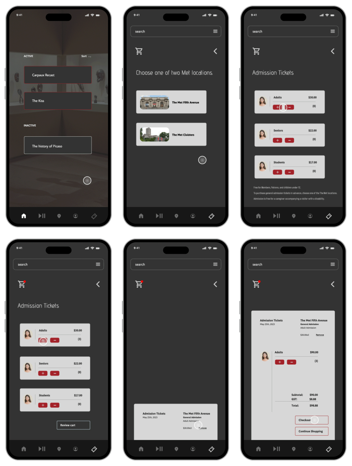
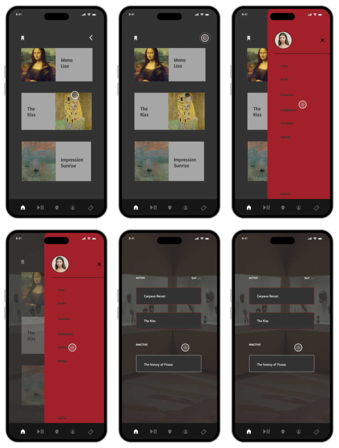
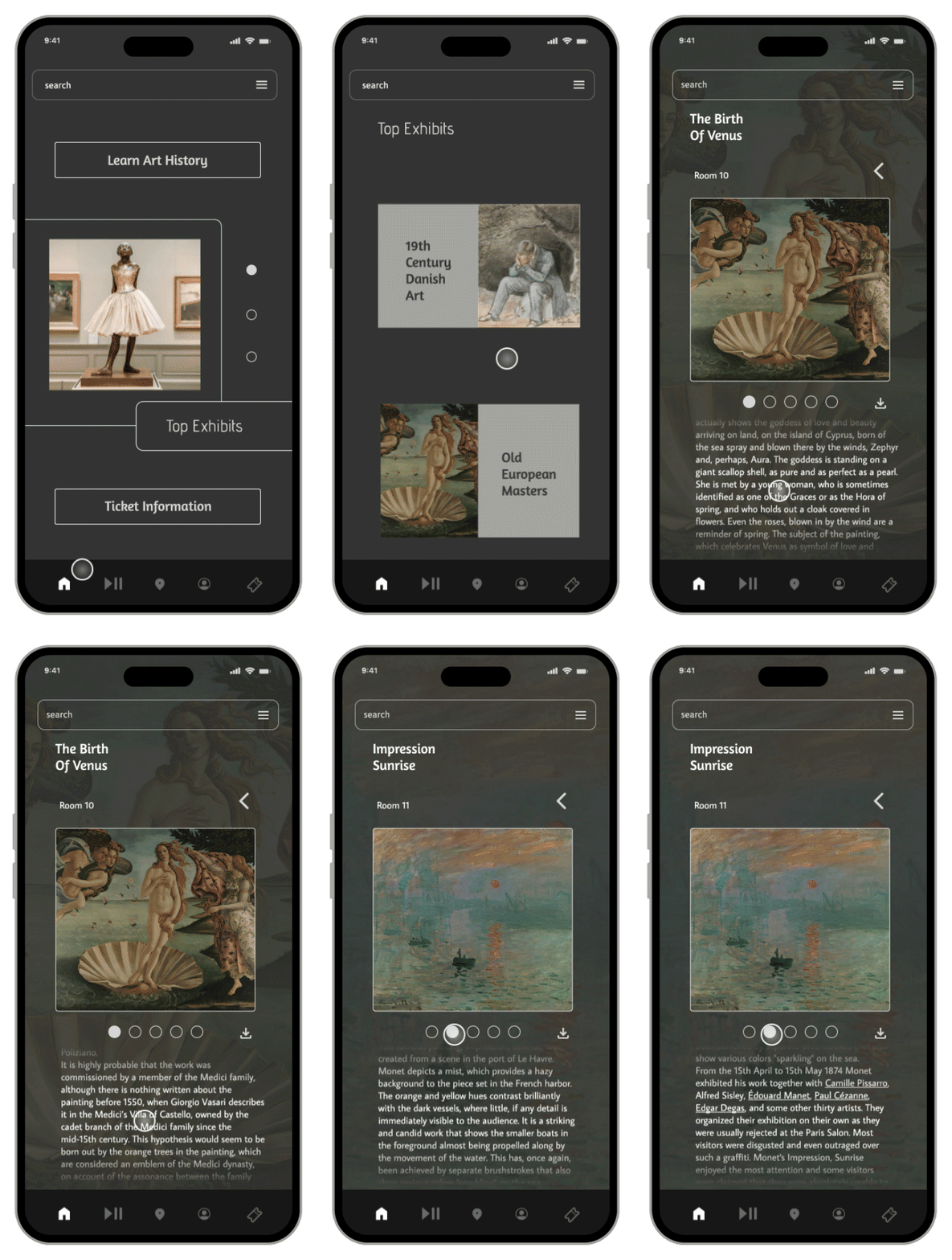
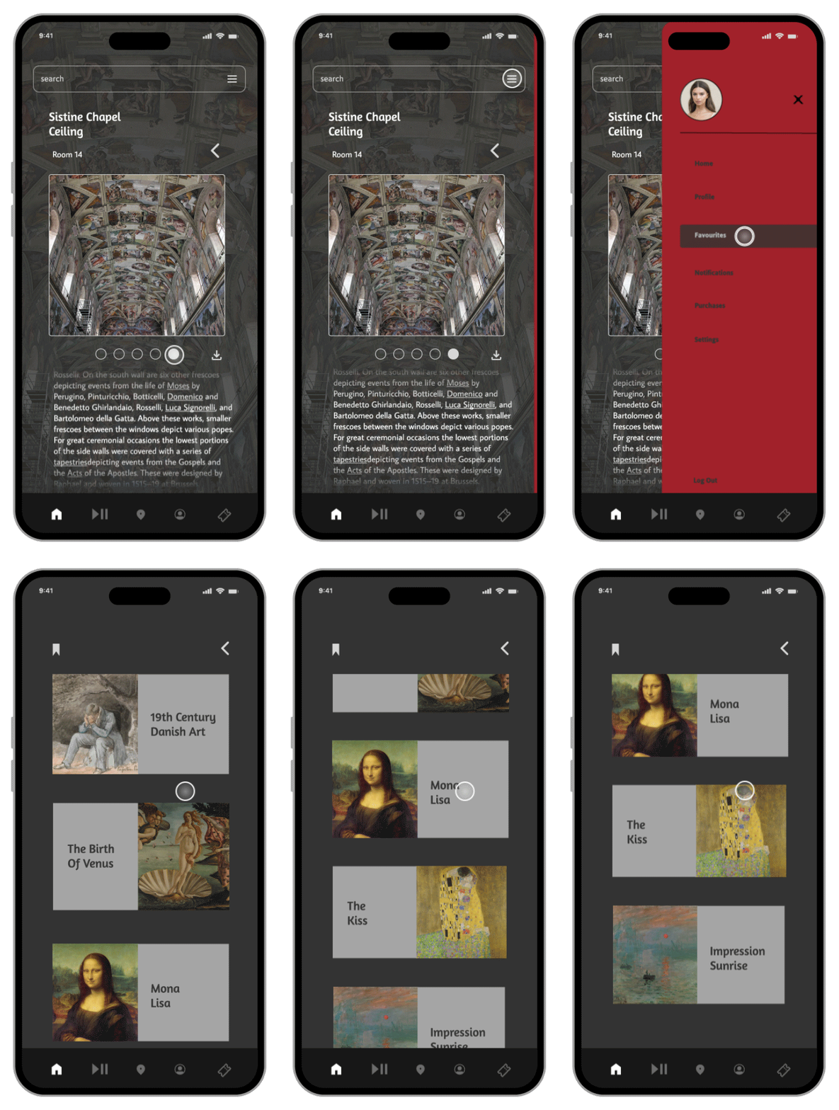
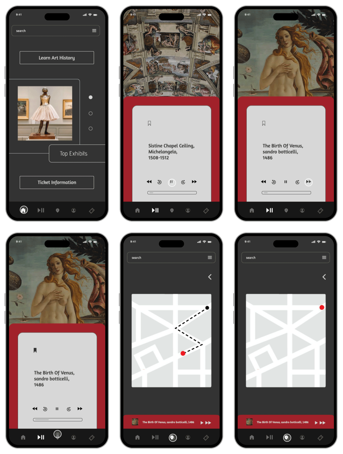
real captures from the interactive figma prototype, sign-up and home screen, the ticket purchasing flow from location selection through order confirmation, accessing audio tours and exhibit purchases, and listening to audio, favouriting, and navigating to maps and favourites from the menu.