brand identity
symphony woods development company
symphony woods is a boutique real estate development company building communities rooted in nature and craftsmanship. i built their entire brand identity from scratch, logo, colour, typography, print, digital, and everything in between.
the brief
newly established, no visual identity, no market presence. the ask was a brand that felt warm, sophisticated, and connected to the natural world, something that could hold up with investors and clients alike.
process
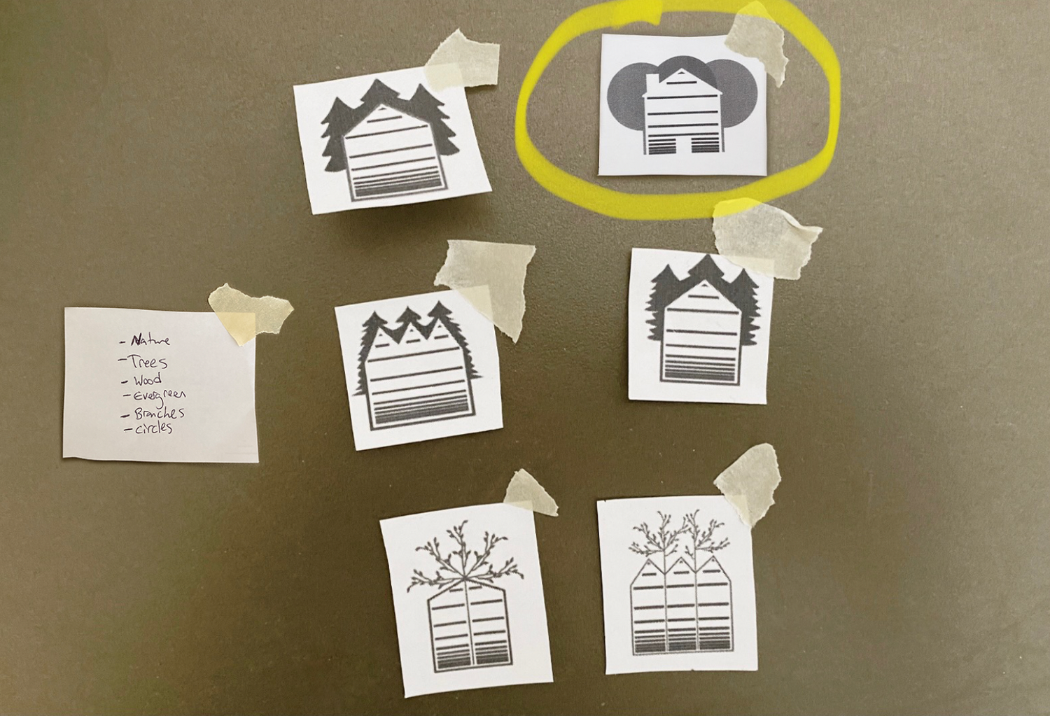
i started with sketches, pulling from the company name itself: trees, wood, evergreen, branches, architecture. the mark needed to feel both natural and structural. i settled on a warm palette of golds, creams, and deep olive to communicate luxury without being cold, then paired it with a classic serif that felt timeless rather than trendy.
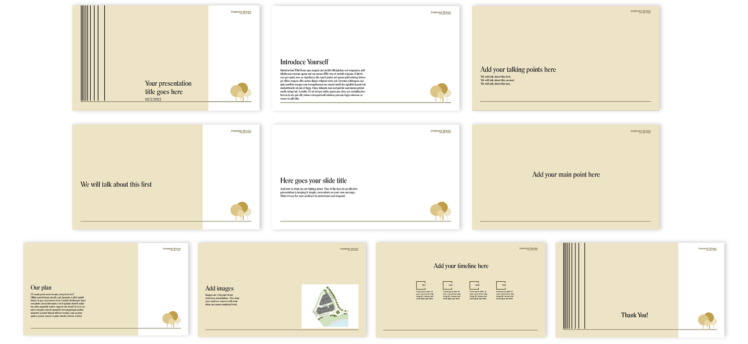
from there the identity was extended across every touchpoint: business cards, outdoor signage, branded merch, linkedin presence, and a full suite of presentation templates, so the brand could show up consistently no matter the context.
result
a complete brand system built for a company starting from zero, designed to be credible, cohesive, and built to last.