brand + web
torgan partners
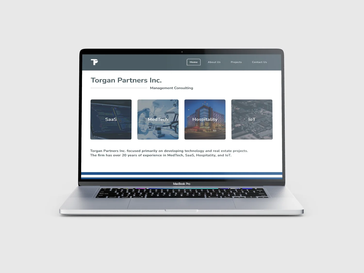
torgan partners is a toronto-based management consulting and investment firm with 20+ years across medtech, saas, hospitality, and iot. i led a full rebrand and website overhaul, repositioning the firm for enterprise clients and investors.
the problem
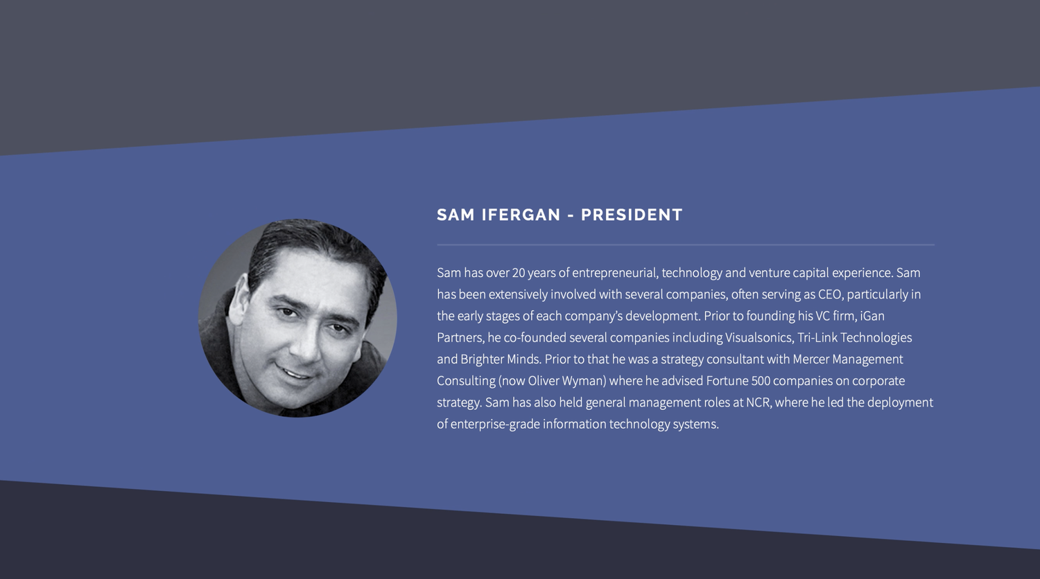
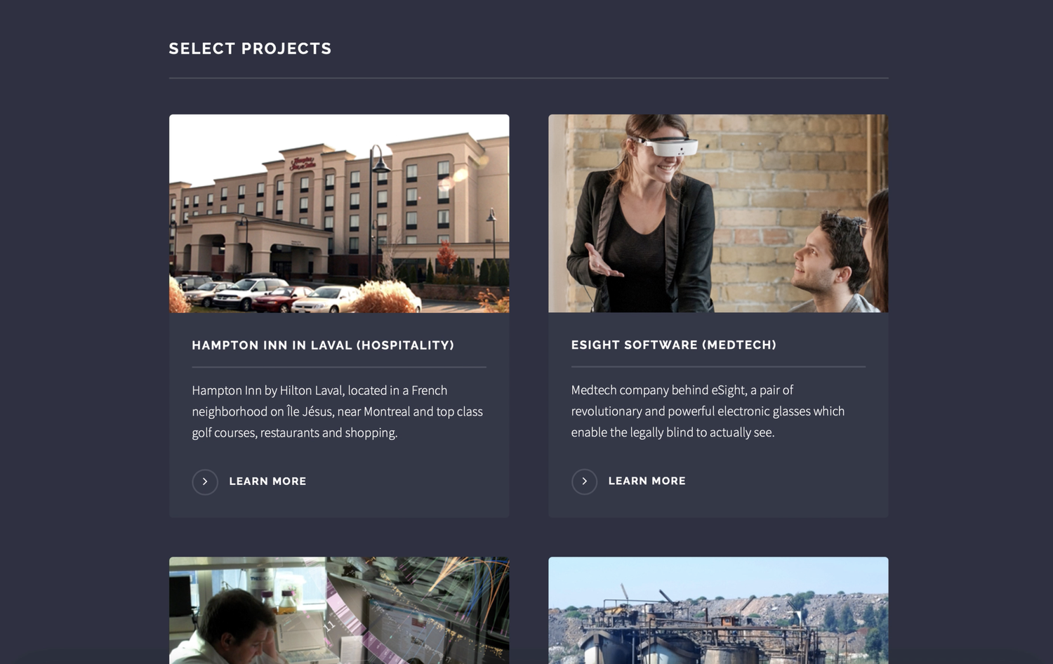
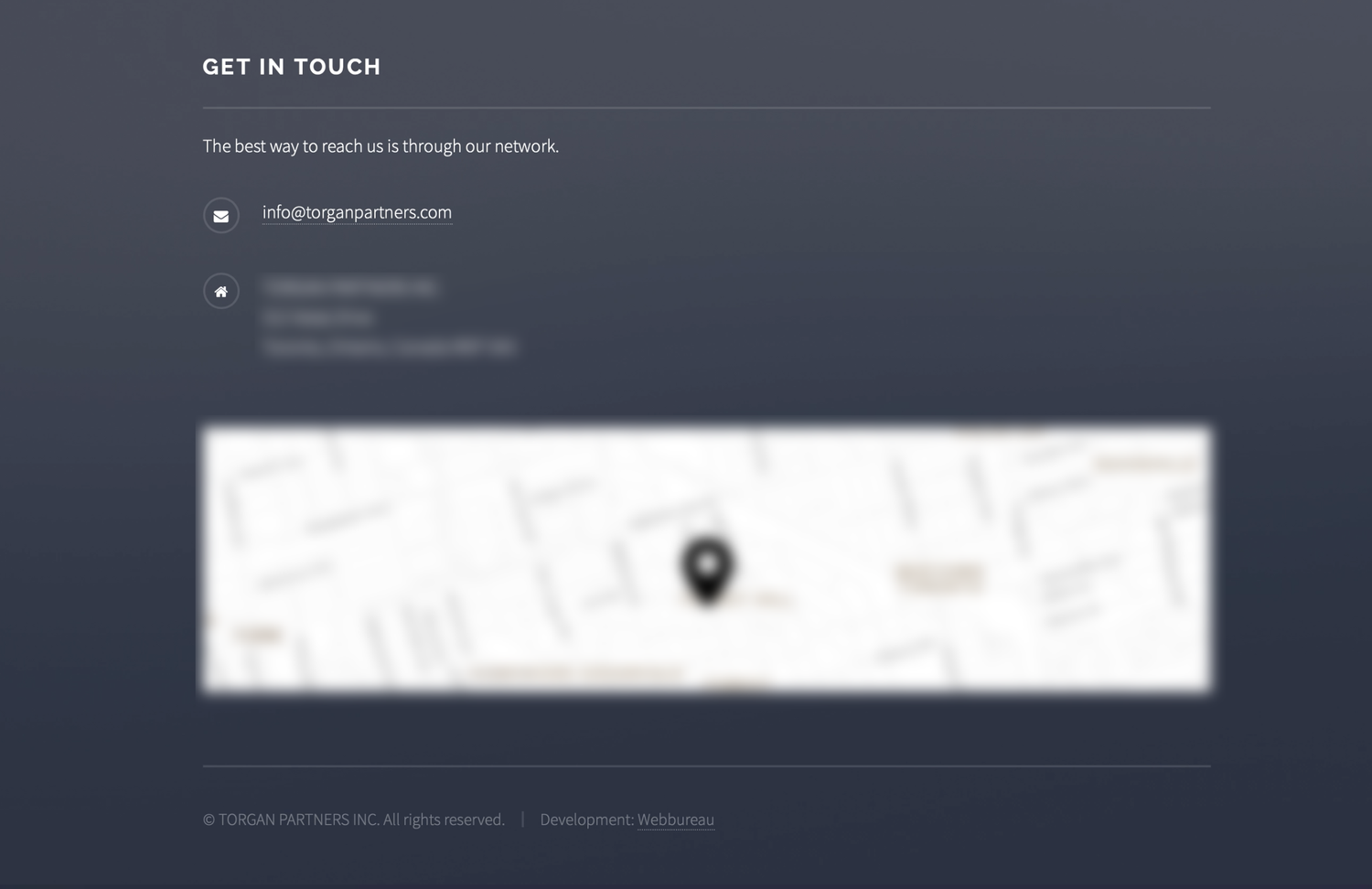
the existing site was dark, heavy, and generic. all-caps typography, stock imagery, no hierarchy, no personality. it didn't communicate who they were or why anyone should trust them.
before, the original site


the process
i started with a competitive analysis across medtech, saas, and hospitality firms to figure out where torgan needed to sit visually. the answer was clean, light, and credible, a direct contrast to the dark original. the logo is a bold sans-serif wordmark, simple, tech-forward, easy to remember. information architecture was mapped in figma from lo-fi through hi-fi, restructured across desktop and mobile to clearly present four investment sectors.
delivery
i collaborated with a developer to ship everything, design, content, and animated features. hosted on flywheel, fully ada, wcag, and aoda compliant. the primary blue was chosen to meet wcag aa color contrast standards, not just brand fit, ensuring text and ui elements stay legible against it.
result
the site launched fully responsive and accessible. after a period offline, the client chose to bring the original design back rather than rebuild.